
Introduction If you’re preparing to publish your book, you may be wondering: “Do I really need professional book formatting?” It’s a common question, especially for new authors who have already invested time in writing and editing their manuscript. Formatting can sometimes feel like a minor detail, but in reality, it plays a major role in how your book is perceived. In this guide, we’ll explain why professional book formatting matters, what it involves, and how it can impact your success as an author. What Is Book Formatting? Book formatting is the process of preparing your manuscript so it looks professional in both print and digital formats. This includes setting up layout, spacing, fonts, margins, and chapter structure. It also ensures your book meets the technical requirements of publishing platforms like Amazon Kindle. A well-formatted book feels easy to read and visually consistent, while poor formatting can distract readers and reduce the overall quality of your work. Why Is Formatting So Important? Many authors ask: “Does formatting really affect how my book performs?” The answer is yes. Formatting directly affects the reader’s experience. If your book looks unprofessional, readers may assume the content is of lower quality, even if the writing is strong. Clean formatting helps maintain focus on the content, making it easier for readers to stay engaged from start to finish. Formatting for eBooks vs Print Another common question is: “Is formatting different for ebook and paperback?” Yes, and understanding the difference is essential. eBook formatting needs to be flexible so it works across different screen sizes and devices. Print formatting, on the other hand, requires fixed layouts with precise margins and spacing to ensure the book prints correctly. If formatting is not handled properly, it can lead to issues such as awkward page breaks, inconsistent spacing, or text that doesn’t display correctly. How Poor Formatting Affects Your Book Poor formatting can have a bigger impact than many authors expect. Readers may notice uneven spacing, inconsistent fonts, or layout issues that make the book harder to follow. In digital formats, formatting errors can cause text to display incorrectly, which can be frustrating for readers. These issues can lead to negative reviews and reduce the credibility of your book, even if the content itself is strong. What Does Professional Formatting Include? Professional formatting goes beyond basic layout. It ensures your book is structured correctly, visually consistent, and fully compatible with publishing platforms. This includes setting up chapters properly, maintaining consistent typography, and ensuring your book looks polished in both digital and print formats. For new authors, this level of detail can make a significant difference in how the final book is received. Can You Format a Book Yourself? A common question is: “Can I format my book myself?” While it is possible, many authors find it more complex than expected. Formatting requires attention to detail and an understanding of how different platforms handle text and layout. Mistakes are easy to make and can affect the final result. For authors who want a professional finish, using dedicated formatting support is often the more reliable option. When Should Formatting Be Done? Formatting should take place after your manuscript has been fully edited and proofread. Trying to format too early can lead to extra work, as changes to the text may disrupt the layout. Completing formatting at the right stage ensures a smoother process and a cleaner final result. Common Formatting Mistakes New authors often underestimate how important formatting is. Some rely on basic word processors without understanding publishing standards, while others overlook details like spacing, alignment, or chapter consistency. These small issues can quickly add up and affect the overall quality of the book. Avoiding these mistakes helps ensure your book is ready for readers. Final Thoughts So, why does professional book formatting matter more than you think? Because it directly affects how your book looks, reads, and is received by your audience. It’s one of the final steps in the publishing process, but it has a lasting impact on the reader’s experience. For new authors, getting formatting right is an essential part of producing a book that feels complete and professional. FAQs What is book formatting? Book formatting is the process of preparing your manuscript so it is structured and displayed correctly for publishing. Do I need professional formatting for my book? While it is possible to do it yourself, professional formatting helps ensure your book meets publishing standards. Does formatting affect book sales? Yes, poor formatting can lead to a negative reading experience, which can impact reviews and overall performance.
Introduction If you’re writing fiction, you’ve probably asked: “What do I actually need to publish my fiction book?” Finishing your manuscript is a major step, but turning it into a professionally published book requires more than just good writing. Fiction authors need to focus on presentation, readability, and making their book appealing to the right audience. This guide breaks down the key steps in a clear, practical way so you can move from manuscript to published book with confidence. What Do Fiction Authors Need to Publish? At a basic level, fiction authors need editing, formatting, cover design, and a way to distribute their book. These are the core elements that ensure your book is ready for readers and competitive within your genre. While the process is similar across all books, fiction relies heavily on reader experience, which means quality and presentation are especially important. Editing and Proofreading A common question is: “Do fiction authors need professional editing?” Editing is essential for improving flow, pacing, and clarity. It helps refine your story so it reads smoothly and keeps readers engaged. Proofreading then ensures there are no small errors before publication. Skipping this step can affect how your book is perceived, even if the story itself is strong. Formatting Your Fiction Book Many authors ask: “How should a fiction book be formatted?” Formatting shapes how your book looks and feels to read. Clean spacing, consistent structure, and correct layout all contribute to a professional finish. For fiction, readability is key. A well-formatted book keeps readers focused on the story without distractions. Cover Design for Fiction Books Another important question is: “How important is a book cover for fiction?” Your cover is often what attracts readers first. It needs to clearly signal your genre and create interest at a glance. A strong cover design helps your book stand out, especially in crowded categories like fantasy, romance, and crime fiction. Publishing and Distribution Once your book is prepared, the next step is making it available. Many fiction authors ask: “How do I publish my novel?” This involves uploading your book to publishing platforms and choosing how it will be distributed. Whether you choose digital, print, or both, the goal is to make your book accessible to your audience. Marketing Your Fiction Book Publishing is only part of the process. Visibility matters just as much. “How do fiction authors promote their books?” Building an online presence, having a clear launch plan, and making your book easy to find all contribute to better results. Even simple steps can help your book reach more readers. Common Mistakes to Avoid Fiction authors often rush the final stages of publishing. Some skip editing, rely on basic formatting, or choose covers that don’t reflect their genre. Others assume that publishing alone will lead to sales. Taking the time to get these elements right can make a significant difference. Final Thoughts So, what do fiction authors need to publish a book successfully? A well-written manuscript is only the starting point. Professional editing, strong formatting, effective cover design, and a clear publishing plan all play a role in bringing your book to life. By focusing on these essentials, fiction authors can create books that not only look professional but also connect with readers.
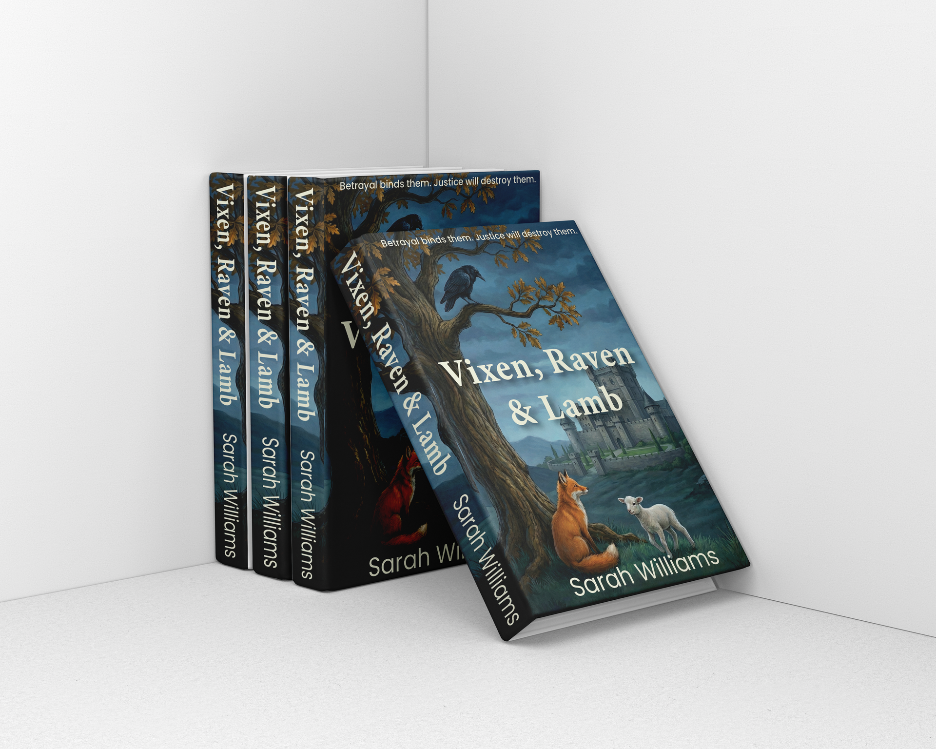
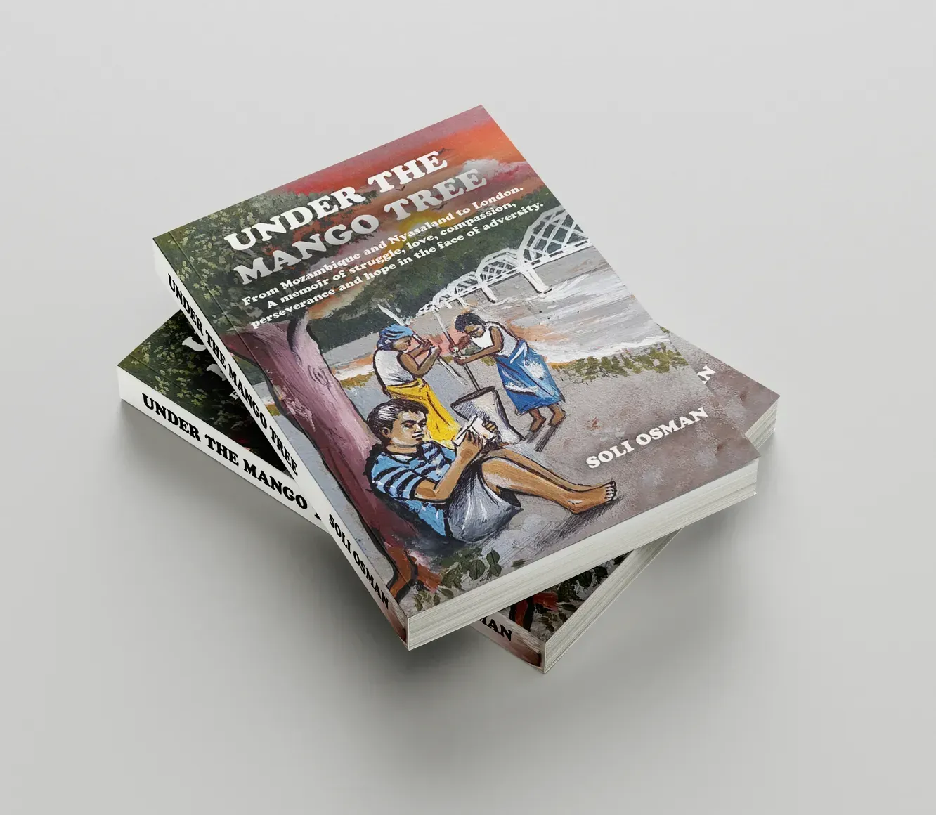
Introduction If you’re getting ready to publish your book, one of the most common questions you’ll face is: “What is the best format to publish my book in?” With options like eBook, paperback, and hardcover, it can be difficult to know which route is right for you. Each format has its own advantages, and the best choice often depends on your goals, your audience, and how you want your book to be experienced. In this guide, we’ll explain the differences between eBook, paperback, and hardcover formats, helping you decide which option makes the most sense for your book. What Are the Main Book Formats? Before choosing a format, it’s important to understand what each option offers. An eBook is a digital version of your book that can be read on devices like Kindles, tablets, and smartphones. A paperback is a printed book with a flexible cover, while a hardcover is a more durable, premium version with a rigid cover. Each format serves a different purpose, and many authors choose to publish in more than one to reach a wider audience. Why Do Authors Choose eBooks? A very common search is: “Should I publish my book as an ebook?” eBooks are one of the most accessible ways to publish. They are quick to produce, easy to distribute, and widely used by readers who prefer digital formats. For many authors, especially those publishing fiction or releasing multiple books, eBooks offer flexibility and speed. They also allow for global distribution without the need for physical printing. However, the formatting needs to be done carefully to ensure the book displays correctly across different devices. When Is Paperback the Best Option? Many authors also ask: “Is paperback better than ebook?” Paperback books are still one of the most popular formats because they provide a physical product that readers can hold, collect, and share. They are often more affordable than hardcover books, making them accessible to a wide audience. For genres like fiction, memoir, and general non-fiction, paperback is often the standard choice. It strikes a balance between cost and quality while still offering a professional presentation. Formatting is especially important here, as the layout must be precise to ensure the book prints correctly. What Are the Benefits of Hardcover Books? Another question that comes up is: “Should I publish my book as a hardcover?” Hardcover books are typically seen as premium products. They are more durable and often used for special editions, gift books, or titles where presentation is particularly important. For authors publishing business books or high-value content, hardcover can help position the book as more authoritative. However, it is usually more expensive to produce and may not be necessary for every project. Do You Need to Choose Just One Format? A question many authors ask is: “Can I publish my book as both an ebook and paperback?” The answer is yes — and in many cases, this is the best approach. Publishing in multiple formats allows you to reach different types of readers. Some prefer the convenience of digital reading, while others prefer the experience of a physical book. By offering both, you increase your book’s accessibility and potential audience. How Does Format Affect Your Publishing Process? The format you choose influences how your book is prepared. eBooks require flexible formatting that works across different screen sizes, while print formats like paperback and hardcover require fixed layouts with precise margins, spacing, and alignment. Cover design also changes depending on the format. A print book needs a full cover design including spine and back cover, whereas an eBook only requires a front cover. Understanding these differences helps ensure your book is prepared correctly for each format. Which Format Is Best for First Time Authors? Many new authors search: “What is the best format for a first time author?” For first time authors, starting with both eBook and paperback is often a practical choice. This allows you to reach a wide audience without overcomplicating the process. An eBook offers speed and accessibility, while a paperback provides a tangible product that can be shared, sold, and promoted more easily. Hardcover can be considered later, depending on your goals and how your book performs. Common Mistakes When Choosing a Book Format Choosing the wrong format — or not understanding the requirements of each — can create problems later. Some authors focus only on one format without considering their audience, while others underestimate the importance of proper formatting and design. In some cases, authors rush into publishing without preparing their files correctly for print or digital platforms. Taking the time to understand each format can help you avoid these issues and ensure your book looks professional in every version. Final Thoughts So, what is the best format to publish your book in? There isn’t a single answer — it depends on your goals, your audience, and how you want your book to be experienced. For many authors, combining formats is the most effective approach, allowing you to reach readers in different ways. By understanding the differences between eBook, paperback, and hardcover, you can make informed decisions and prepare your book for success. FAQs Is it better to publish an ebook or paperback? Both have advantages. eBooks offer accessibility and speed, while paperbacks provide a physical product that many readers prefer. Can I publish my book in multiple formats? Yes, many authors publish in both digital and print formats to reach a wider audience. Do hardcover books sell better than paperbacks? Not always. Hardcover books are often seen as premium, but paperbacks are usually more affordable and widely purchased.
Introduction If you’re preparing to publish your book, one of the most common questions is: “What publishing services do I actually need for my book?” The answer isn’t always straightforward. The services you need can vary depending on your book genre, your goals as an author, and how you plan to publish. Whether you’re writing fiction, a children’s book, or a business guide, choosing the right publishing services can make a significant difference in how your book looks, reads, and performs once it’s available to readers. In this guide, we’ll break down how to choose the right publishing services based on your genre, using real-world search questions and practical insights to help you make informed decisions. Why Your Book Genre Matters When Choosing Publishing Services A question many authors don’t initially consider is: “Do different genres need different publishing services?” The core publishing steps are often the same — editing, formatting, cover design, and distribution — but how these are applied can vary significantly depending on your genre. For example, a fantasy novel may require a visually detailed cover to stand out, while a business book needs a clean, professional layout that reflects authority and expertise. A children’s book, on the other hand, often depends heavily on design, layout, and visual presentation. Understanding these differences helps you prioritise the services that will have the biggest impact on your book. What Publishing Services Do Most Authors Need? Before focusing on genre-specific needs, it’s important to understand the core services that apply to most books. Almost every author will need editing and proofreading to ensure their manuscript is clear and error-free. Formatting is also essential, as it prepares your book for both print and digital platforms. Cover design plays a major role in attracting readers, and distribution ensures your book is available to buy. These services form the foundation of publishing, but how you approach each one should be guided by your genre. Choosing Publishing Services for Fiction Authors If you’re writing fiction, you’ve probably asked: “What do fiction authors need to publish a book?” Fiction relies heavily on reader engagement, so clarity, pacing, and presentation are key. Editing is particularly important here, as it helps refine storytelling and improve flow. Cover design also plays a crucial role. Readers often make decisions based on visual cues, so your cover needs to clearly communicate your genre — whether that’s fantasy, romance, or crime fiction. Formatting should ensure a smooth reading experience, especially for digital formats where many fiction books are consumed. Choosing Publishing Services for Children’s Book Authors Children’s books have their own unique requirements, which leads many authors to ask: “How do you publish a children’s book properly?” In this case, design and layout are just as important as the writing itself. The way text and images work together can define the success of the book. Professional formatting ensures that the book is visually appealing and easy to follow, while high-quality cover design helps it stand out to both children and parents. Editing is still important, but the focus is often on clarity and readability rather than complexity. Choosing Publishing Services for Business Book Authors Business authors often search: “What services do I need to publish a professional book?” For business books, the priority is credibility. Your content needs to be clear, well-structured, and professionally presented. Editing ensures your ideas are communicated effectively, while formatting helps create a clean and organised layout. A strong cover design should reflect authority and professionalism rather than creativity alone. In this genre, readers are often looking for expertise, so every element of your book should reinforce that impression. Does Book Format Affect the Services You Need? Another common question is: “Do I need different services for ebook vs paperback?” The format you choose can influence how your book is prepared. eBooks require formatting that works across multiple devices, ensuring readability on screens of all sizes. Print books, such as paperback or hardcover, require precise layout settings to ensure the final product looks professional when physically produced. In many cases, authors choose to publish in multiple formats, which means your formatting and design need to work across both digital and print versions. How Do You Know Which Services to Prioritise? With so many options available, it’s natural to wonder: “Which publishing services should I invest in first?” The answer depends on your goals, but most authors benefit from focusing on quality over shortcuts. Editing and proofreading are essential for credibility, while formatting and cover design directly affect how your book is perceived. If you’re unsure where to start, it’s often best to focus on the services that improve the reader’s experience and make your book look professional from the outset. Common Mistakes When Choosing Publishing Services Many authors make decisions based on cost or convenience rather than quality. Some skip editing, rely on basic formatting tools, or choose cover designs that don’t reflect their genre. Others try to handle everything themselves without fully understanding publishing standards. These choices can impact how your book is received, even if the content itself is strong. Taking the time to choose the right services can make a noticeable difference in your results. Final Thoughts So, how do you choose the right publishing services for your book genre? It starts with understanding what your genre demands and making sure your book meets those expectations. While the core services remain the same, the way they are applied should reflect the type of book you are publishing. By focusing on quality and choosing services that support your specific genre, you can create a book that not only looks professional but also connects with the right audience. FAQs: What publishing services do I need to publish a book? Most authors need editing, formatting, cover design, and distribution, but the exact approach depends on the genre and format of the book. Do different genres require different publishing services? Yes, while the core services are similar, the way they are applied varies depending on genre-specific expectations. Should I publish my book as an ebook or paperback? Many authors choose both formats, as this allows them to reach a wider audience across digital and print platforms.
Introduction If you’ve finished writing your manuscript, you’re likely asking, how do I turn my manuscript into a published book? This is one of the most common questions independent authors search for, and for good reason. Moving from a completed manuscript to a professionally published book involves several important steps, each of which plays a role in how your book is received by readers. In this guide, we’ll walk through the complete process of turning a manuscript into a published book, using clear, practical steps that new and experienced authors can follow. What Does It Take to Turn a Manuscript Into a Book? Before publishing, your manuscript needs to go through a series of stages that prepare it for readers. These include editing, formatting, design, publishing setup, and distribution. Many authors search for the steps to publish a book after writing it. Understanding each stage will help you avoid common mistakes and ensure your book meets professional standards. 1. Editing Your Manuscript The first step is refining your manuscript through editing. A common question is, do I need editing before publishing my book? Editing improves the structure, clarity, and overall quality of your writing. It ensures your ideas are presented clearly and that your book is engaging for readers. This stage may involve structural edits as well as line editing, depending on the needs of your manuscript. 2. Proofreading for Accuracy After editing, proofreading is the final check before publication. While editing focuses on improving the content, proofreading focuses on catching small errors such as spelling, grammar, and punctuation. This step ensures your book is polished and ready for readers. 3. Formatting Your Book for Print and Digital Once your manuscript is complete, it needs to be formatted correctly. A frequent search is: “How do I format my manuscript for publishing?” Formatting involves preparing your book so it looks professional in both print and digital formats. This includes layout, spacing, fonts, and chapter structure. Proper formatting ensures your book is readable and meets the requirements of publishing platforms like Amazon Kindle. 4. Designing a Professional Book Cover Next, you’ll need a book cover that represents your work effectively. Your cover is a key part of your book’s presentation. It helps attract readers and communicates your genre and style at a glance. A professionally designed cover can significantly improve your book’s visibility and appeal. 5. Setting Up ISBN and Metadata To publish your book, you’ll need to set up key details that allow it to be distributed and discovered. A common question is: “What do I need to publish my book online?” This includes obtaining an ISBN and preparing your metadata, such as your book title, keywords, and categories. These details help retailers and search platforms understand your book and show it to the right audience. 6. Publishing Your Book At this stage, your book is ready to be published. Amazon / Online Publishing involves uploading your formatted files, cover design, and metadata to a platform. This allows your book to be made available for purchase in print, digital, or both formats. Self publishing platforms make this process accessible, allowing authors to publish without needing a traditional publisher. 7. Printing and Distribution Once published, your book needs to be available to readers. A common search is: “How do I distribute my book?” Printing and distribution ensure your book can be purchased through online retailers and, in some cases, physical outlets. Print-on-demand services are often used to produce books as they are ordered. This step ensures your book reaches your intended audience. 8. Marketing Your Book After publishing, the focus shifts to visibility. Authors often ask: “How do I market my book after publishing?” Marketing involves promoting your book so readers can find it. This might include building an author website, creating online listings, and developing a strategy to reach your audience. Without marketing, even a well-produced book may struggle to gain attention. Common Mistakes When Turning a Manuscript Into a Book Many authors rush the process after finishing their manuscript. Common mistakes include skipping editing, using basic formatting, or not investing in a professional cover design. Others overlook metadata or assume that publishing alone will lead to sales. Taking the time to follow each stage properly can significantly improve your results. Final Thoughts So, how do you turn a manuscript into a published book? It involves more than simply uploading your file. You need to refine your manuscript, prepare it professionally, and ensure it is ready for readers across multiple platforms. By following each step carefully, independent authors can turn their manuscript into a high-quality published book that is ready to compete in the market. FAQs How long does it take to turn a manuscript into a book? The timeline depends on how long editing, formatting, and design take, but it can vary from a few weeks to several months. Can I publish my manuscript without editing? It is possible, but not recommended. Editing is essential for producing a professional-quality book. What is the easiest way to publish a book? Self publishing is often the most accessible option, allowing authors to publish their work quickly and maintain full control.
Introduction Finishing your manuscript is a major milestone, but many new authors quickly find themselves asking: “What happens after you finish writing a book?” While completing your first draft is a huge achievement, it’s only the beginning of the publishing journey. Knowing what to do next can make the difference between a book that feels unfinished and one that is ready for readers. In this guide, we’ll walk through the exact steps new authors should take after writing a book, using real search questions and practical advice to help you move forward with confidence. What Should You Do After Writing a Book? One of the most common searches is: “What are the next steps after writing a book?” After completing your manuscript, the focus shifts from writing to preparing your book for publication. This involves refining your content, improving presentation, and getting everything ready for distribution. The process typically includes editing, formatting, cover design, setting up publishing details, and planning how your book will reach readers. 1. Take a Break Before Editing A question many authors don’t think to ask is “Should I edit my book straight away?” It’s usually best to step away from your manuscript for a short period. Taking a break allows you to return with a fresh perspective, making it easier to spot issues with structure, clarity, and consistency. Even a short break can significantly improve the quality of your self-editing before moving on to professional support. 2. Review and Refine Your Manuscript Once you return to your manuscript, the next step is to review it carefully. This stage involves improving flow, tightening language, and making sure your ideas are clearly communicated. Many authors search “How do I edit my own book?” While self-editing is an important step, it is only part of the process. It helps prepare your manuscript for professional editing, which ensures your book meets publishing standards. 3. Professional Editing and Proofreading After refining your manuscript, professional editing becomes essential. New authors often ask: “Do I need a professional editor after writing a book?” The answer is yes if you want your book to be taken seriously. Professional editors help improve structure, readability, and consistency, while proofreading ensures there are no small errors before publication. This step transforms your manuscript into a polished, publish-ready book. 4. Formatting Your Book for Publishing Another key step is formatting your manuscript so it looks professional. A common question is: “How do I prepare my book for print or Kindle? ” Formatting includes setting up layout, spacing, fonts, and chapter structure so your book works across both print and digital platforms. Proper formatting ensures your book looks clean, readable, and consistent for your audience. 5. Designing a Professional Book Cover Once the inside of your book is complete, attention turns to the cover. Many people wonder, “When should I design my book cover?” The cover should be created once your manuscript is close to final. A professional cover is essential for attracting readers, especially in online marketplaces where first impressions matter. Your cover should clearly reflect your genre and appeal to your target audience. 6. Setting Up ISBN and Metadata At this stage, you also need to prepare your book for distribution. A frequent question is: “What do I need to publish my book online?” You will need an ISBN if you plan to sell your book through retailers, as well as accurate metadata. Metadata includes your book title, keywords, and categories, which help readers find your book through search. Getting this right improves your book’s visibility on platforms like Amazon. 7. Choosing How to Publish Your Book After preparing your book, the next decision is how you want to publish it. Many authors ask: “Should I self publish or find a publisher after writing a book?” Self publishing is often the most accessible option for new authors, allowing you to move forward quickly while maintaining control over your work. It also gives you flexibility in how your book is produced and distributed. 8. Planning Your Book Launch and Marketing A key step that is often overlooked is marketing. New authors frequently search: “How do I promote my book after writing it?” Publishing your book is only part of the process. You also need to make sure readers can find it. This might involve setting up an author website, building an online presence, and planning how you will promote your book at launch. Without a clear marketing approach, even a well-produced book may struggle to gain attention. Common Mistakes After Finishing a Book After completing a manuscript, it’s easy to rush into publishing without proper preparation. Some common mistakes include skipping professional editing, using basic formatting tools, or not investing in a quality cover design. Others underestimate the importance of metadata or assume that publishing alone will generate sales. Taking the time to follow each step properly can significantly improve your results. Final Thoughts So, what happens after you finish writing a book? The journey continues with refining your manuscript, preparing it for publication, and making sure it is ready to reach readers. Each step plays an important role in turning your writing into a professional, publishable book. For new authors, understanding this process early can make the entire experience more manageable and far more successful. FAQs What is the next step after finishing a book? The next step is reviewing and editing your manuscript before preparing it for professional editing and publication. How long does it take to publish a book after writing it? The timeline varies, but it depends on how quickly you complete editing, formatting, and design. Can I publish my book immediately after writing it? While it is possible, it is not recommended. Proper editing, formatting, and preparation are essential for producing a professional-quality book.
Introduction If you're considering publishing your book, you’ve probably asked “Is self publishing worth it?” For independent authors in 2026, self publishing has become one of the most accessible and popular ways to bring a book to market. But while it offers flexibility and control, it also comes with responsibilities that many new authors underestimate. In this guide, we’ll take a realistic look at self publishing, including the benefits, the challenges, and whether it’s the right choice for you. What Is Self Publishing? Self publishing means taking full control of the publishing process without using a traditional publishing house. As an independent author, you are responsible for preparing your book, managing production, and making it available to readers. This includes everything from editing and formatting to cover design, distribution, and marketing. While this may sound like a lot, it also gives you complete ownership over your work. Why Are So Many Authors Choosing Self Publishing? A common search question is: “Why do authors choose self publishing?” The main reason is control. Self publishing allows authors to make decisions about every aspect of their book, from the cover design to pricing and distribution. It also offers faster publishing timelines. Traditional publishing can take months or even years, whereas self publishing allows you to bring your book to market much more quickly. In addition, authors often earn higher royalties compared to traditional publishing models, making it an attractive option for those looking to build a long-term writing career. What Are the Benefits of Self Publishing? Self publishing provides several clear advantages for independent authors. You retain full creative control, meaning your book stays true to your vision without external changes. You also have the flexibility to update your book at any time, whether that’s correcting errors or improving content. Another major benefit is speed. Once your book is ready, you can publish it without waiting for approval from a publisher. This is particularly valuable for authors who want to release multiple books or build momentum quickly. What Are the Challenges of Self Publishing? Many authors also ask: “What are the disadvantages of self publishing?” The biggest challenge is that you are responsible for everything. Without the support of a traditional publisher, you need to ensure your book is professionally edited, formatted, and designed. Marketing is another key challenge. Simply publishing a book does not guarantee that readers will find it. You need a strategy to build visibility and attract an audience. There is also an upfront investment involved. Professional services such as editing and cover design require time and resources, but they are essential for producing a high-quality book. How Much Does It Cost to Self Publish a Book? One of the most searched questions is: “How much does it cost to self publish a book?” The cost can vary depending on the level of professional support you choose. Some authors attempt to do everything themselves, but this often leads to lower quality results. Investing in key areas such as editing, formatting, and cover design can make a significant difference in how your book is received. While costs can vary, treating self publishing as a professional process rather than a shortcut is important for long-term success. Is Self Publishing Better Than Traditional Publishing? Another common question is “Is self publishing better than traditional publishing?” The answer depends on your goals as an author. Self publishing is ideal if you want full control, faster timelines, and higher royalties. Traditional publishing may be better suited to authors looking for established industry support and wider access to certain distribution channels. For many independent authors, self publishing offers a more flexible and accessible route, especially when combined with professional support. What Do You Need to Self Publish Successfully? To succeed with self publishing, independent authors need more than just a completed manuscript. You need a professionally edited book, a well-designed cover, and properly formatted files for both print and digital platforms. You also need to ensure your book has the correct ISBN and metadata so it can be discovered by readers. Beyond this, having a clear marketing approach is essential. This might include building an author website, creating an online presence, and planning how you will promote your book after launch. Is Self Publishing Worth It for First Time Authors? For first time authors, self publishing can be a highly rewarding option — but only if approached correctly. It allows you to bring your book to life without waiting for approval from traditional publishers. However, it also requires a commitment to quality and a willingness to invest in the right support. Authors who treat self publishing as a professional process are far more likely to see positive results. Final Thoughts So, is self publishing worth it in 2026? For many independent authors, the answer is yes. It offers control, flexibility, and the opportunity to publish on your own terms. However, it is not a shortcut — it requires planning, effort, and the right expertise. If you are prepared to approach it professionally, self publishing can be one of the most effective ways to turn your manuscript into a successful book. FAQs Is self publishing profitable? Self publishing can be profitable, especially if you retain higher royalties and build a strong catalogue of books over time. How long does self publishing take? The timeline depends on how quickly you complete editing, formatting, and design, but it is typically much faster than traditional publishing. Do self published books sell? Yes, self published books can sell well, particularly when supported by professional production and effective marketing strategies.
Introduction If you're a first time author, one of the most common questions you’ll ask is: “What do I actually need to publish a book?” Finishing your manuscript is a huge achievement — but it’s only the beginning of the publishing process. Many new authors quickly realise there are several important steps between writing a book and getting it into readers’ hands. In this guide, we’ll explain exactly what first time authors need to publish a book successfully, using real-world search questions and practical insights to help you understand the full process. What Do First Time Authors Need to Publish a Book? To publish a book professionally, first time authors need a combination of preparation, technical setup, and professional support. This includes editing, formatting, cover design, ISBN registration, distribution, and marketing. Each of these elements plays a vital role in making sure your book meets industry standards and can compete in a crowded marketplace. 1. Professional Editing and Proofreading A very common question is: “Do I need an editor for my first book?” The answer is almost always yes. Even experienced writers benefit from professional editing, and for first time authors it is especially important. Editing improves the overall structure, clarity, and readability of your manuscript, while proofreading ensures there are no small grammatical or spelling errors before publication. Without this step, even a strong story can appear unpolished and may lead to negative reader reviews. 2. Book Formatting and Layout Many new authors search: “ How do I format my book for publishing?” Formatting is what transforms your manuscript into a professional-looking book. It involves setting up the correct layout, spacing, typography, and chapter structure so that your book looks clean and consistent in both print and digital formats. Poor formatting is one of the quickest ways to make a book feel amateur, even if the content itself is strong. Ensuring your book meets publishing standards is essential, particularly if you plan to distribute through platforms like Amazon Kindle. 3. A Professional Book Cover Another frequently asked question is: “ Does book cover design really matter?” Your book cover is often the first thing a potential reader sees, and it plays a major role in whether they decide to click or buy. A professionally designed cover helps establish credibility, communicates your genre clearly, and makes your book stand out in search results. For first time authors, investing in a strong cover design can significantly improve visibility and engagement. 4. ISBN and Metadata Setup You might also be wondering: “What is an ISBN and do I need one?” An ISBN is a unique identifier for your book and is required if you want to sell it through retailers or distribute it widely. Alongside this, metadata — such as your book title, keywords, and categories — helps search engines and platforms understand what your book is about. Getting this right improves your chances of being discovered when readers search for books in your genre. 5. Printing and Distribution A key question many authors ask is: “How do I get my book into shops or online stores?” Printing and distribution ensure your book is available to readers in the formats you choose. This might include print-on-demand services or wider distribution networks that allow your book to appear on major online retailers. The right approach depends on your goals, but ensuring your book is accessible is a crucial part of the publishing process. 6. Marketing and Visibility One of the biggest concerns for new authors is: “How do I promote my book as a first time author?” Publishing your book is only one part of the journey. You also need to make sure readers can find it. This involves building visibility through platforms such as author websites, online listings, and targeted promotion strategies. Without marketing, even a professionally produced book may struggle to gain traction. What Is the Best Way for First Time Authors to Publish? Another common search is: “Should I self publish or use a publisher?” Self publishing has become increasingly popular because it allows authors to retain control over their work, publish faster, and potentially earn higher royalties. However, it also means you are responsible for managing each stage of the process. This is why many first time authors choose to work with professional publishing support to ensure everything is handled correctly. Common Mistakes First Time Authors Make While the process may seem straightforward, there are several common mistakes that can affect your book’s success. Many authors skip professional editing, rely on basic formatting tools, or underestimate the importance of cover design. Others overlook metadata or assume that simply publishing a book will automatically lead to sales. Understanding these challenges early can help you avoid setbacks and improve your chances of publishing successfully. Final Thoughts So, what do first time authors actually need to publish a book? In simple terms, you need more than just a finished manuscript. You need a combination of professional services, the right technical setup, and a clear strategy for getting your book in front of readers. With the right support and preparation, first time authors can successfully navigate the publishing process and produce a book they are proud of. FAQs What is the first step to publishing a book? The first step is completing your manuscript and preparing it for editing and formatting. How much does it cost to publish a book for the first time? Costs vary depending on the level of professional support you choose, including editing, cover design, and distribution. Can I publish a book without a publisher? Yes, many first time authors choose self publishing, which allows full control but requires managing the entire process yourself.
An Introduction to Self-Publishing: Self-publishing gives authors more control than ever before. You decide when to publish, how your book looks, where it’s sold, and how it’s positioned. But with that control comes responsibility. Launch day should feel exciting — not stressful . Yet many independent authors reach the pre-launch stage only to realise they’ve skipped critical preparation steps. Preparing properly before self-publishing is what separates a rushed release from a professional one. Self-Publishing Is a Process, Not a Single Step Publishing independently isn’t just about uploading a file to Amazon or sending a manuscript to print. Before launch day, your book should move through a structured preparation process that ensures: The manuscript is fully proofread Formatting is correct for print and ebook Cover design aligns with genre expectations Metadata is optimised for discoverability Platform requirements are fully understood Skipping these steps can lead to unnecessary complications after publication. Step 1: Ensure Your Manuscript Is Truly Final Many authors mistake “ finished writing ” for “ ready to publish ”. Before self-publishing, your manuscript should be: Structurally complete Professionally proofread Reviewed for consistency Checked for minor errors introduced during editing Even small issues become visible once your book is live. A publishing-ready manuscript gives you confidence before launch. Step 2: Confirm Professional Formatting Formatting plays a critical role in reader experience. For print distribution, this means correct margins, trim sizes, spacing, and layout consistency. For ebook publication, formatting must be responsive and adaptable across Kindle and other devices. Improper formatting can cause broken chapter layouts, distorted Kindle previews, poor readability and negative reader reviews Professional formatting before self-publishing ensures your book looks intentional and credible. Step 3: Optimise Metadata Before Release Metadata is one of the most overlooked elements of independent publishing. Before launch day, review your: Title and subtitle Book description Keywords Categories Author bio Metadata optimisation affects how your book appears in search results, how it is categorised, and how easily readers can discover it. Good preparation here supports long-term visibility — not just initial sales. Step 4: Review Your Cover for Market Alignment A professional book cover is not just visually appealing — it communicates genre and quality instantly. Before self-publishing, ensure your cover: Aligns with reader expectations Meets print and Kindle size requirements Displays clearly as a thumbnail Feels consistent with your book’s tone An unpolished cover can limit engagement, even if the content is strong. Step 5: Understand Platform Requirements Whether you are preparing for Amazon KDP, Kindle release, or print distribution, each platform has specific technical requirements. Before uploading, confirm: Correct file types ISBN setup (for print editions) Royalty and pricing selections Distribution territories Why the Pre-Launch Stage Is So Important The stage before self-publishing is where professionalism is secured. Once your book is live, readers will judge it on presentation, clarity, and quality — not on how much effort you put into writing it. Publishing prematurely can result in negative reviews, formatting complaints, or credibility issues that are difficult to undo. Taking time to prepare properly ensures your launch is smooth and confident. When Authors Benefit From Professional Pre-Launch Support Independent authors often seek support during the pre-launch stage when: Publishing their first book Releasing both print and ebook formats Feeling unsure about platform compliance Preparing for a coordinated launch Wanting reassurance before going live How Dave Palmer Consulting Supports Authors Before Launch At Dave Palmer Consulting, pre-launch preparation is treated as a structured and essential part of the independent publishing journey. Authors receive tailored support across proofreading, formatting, metadata preparation, cover readiness, and platform submission. The focus remains on clarity, transparency, and helping authors publish with confidence. The goal is not speed — it’s professionalism.
Finishing editing feels like a major achievement. You’ve refined your structure, clarified your ideas, tightened your prose, and improved flow. At this point, many independent authors assume their book is ready for publication. But there’s an important stage that often gets overlooked: What happens after editing? Editing improves your manuscript. It does not finalise it. Understanding the difference between editing, formatting, and proofreading is critical if you want your book to meet professional publishing standards. Editing Is Not the Final Stage of Publishing Editing focuses on structure, clarity, tone, pacing, and overall content development. It ensures your message is strong and coherent. However, editing can also introduce new inconsistencies — small typographical errors, spacing issues, or formatting irregularities that appear during revisions. Even minor wording changes can affect layout and flow. This is why the stage after editing matters so much. Why the Post-Editing Stage Is Critical for Independent Authors Independent authors do not have an in-house publishing team reviewing every final detail before release. If you skip the final stages after editing, you risk publishing a manuscript that: Contain minor but visible errors Has formatting inconsistencies Appears rushed or unfinished Undermines reader trust Readers rarely differentiate between editing mistakes and proofreading mistakes — they simply notice when something feels unpolished. Professional publishing standards require a final quality pass before submission or distribution. Step One After Editing: Professional Proofreading Once structural editing is complete, a dedicated proofreading stage ensures: Grammar and punctuation are correct; Word repetition is removed; Minor inconsistencies are corrected; Spacing and layout issues are addressed Proofreading after editing is a safeguard. It protects your credibility and ensures your final draft truly feels complete. For authors preparing for Amazon submission or print distribution, this step is essential. Step Two: Formatting for Print and Ebook Editing does not automatically prepare your manuscript for publication formats. After editing, your book must be formatted properly for: Paperback or hardback print Kindle or other ebook platforms Formatting ensures consistent margins, headings, spacing, chapter breaks, and responsive layout for digital devices. A professionally formatted manuscript looks intentional and polished — which directly influences reader perception. Step Three: Preparing for Submission or Launch Once proofreading and formatting are complete, your manuscript moves into the final preparation stage. At this point, authors should review: Cover alignment with genre expectations Metadata accuracy (title, description, keywords) ISBN details where applicable File compliance for Amazon or Kindle Skipping structured preparation before submission can lead to technical issues, rejected uploads, or post-launch corrections. Common Mistakes Authors Make After Editing Many independent authors assume editing is the last professional service required, as a result, they: Upload unformatted manuscripts to Kindle Skip proofreading because “it’s already been edited” Discover errors only after publication Need to republish corrected editions These mistakes are avoidable with a clear publishing sequence. Editing strengthens the content. Proofreading and formatting prepare it for readers. Why Sequence Matters in Independent Publishing Publishing stages work best in the correct order: Editing Proofreading Formatting Submission and distribution Reversing or skipping stages creates avoidable complications. A well-structured publishing journey improves confidence, efficiency, and professionalism. Independent publishing succeeds when each stage supports the next. How Dave Palmer Consulting Supports Authors After Editing At Dave Palmer Consulting, the post-editing stage is treated as a critical transition point. Authors receive support in preparing their manuscript for publication-ready presentation — including proofreading and professional formatting tailored to print and digital standards. Rather than rushing to submission, the focus is on ensuring every element of the book aligns with professional publishing expectations before launch. The result is clarity, confidence, and a manuscript that is truly ready for readers. In Conclusion Finishing editing is not the end of your publishing journey — it’s the beginning of the final refinement stage. If you want your independently published book to compete confidently in the marketplace, the steps after editing matter just as much as the writing itself. Take the time to proofread, format, and prepare your manuscript properly. When you do, your book will feel complete — not just edited.